 NLJUG – Nederlandse Java User Group NLJUG – de Nederlandse Java User Group – is opgericht in 2003. De NLJUG verenigt software ontwikkelaars, architecten, ICT managers, studenten, new media developers en haar businesspartners met algemene interesse in alle aspecten van Java Technology.
Building Games and Having Fun with Java and JavaFX
Welcome to Part 2 of this five part series!
In Part 1, we introduced the Wordish game with JavaFX and discussed the main UI layout.
In this second part, we’ll discuss some important look and feel enhancements.
We’ll show you specialized Label and Button controls and using pseudo-classes for advanced CSS styling.
We’ll also cover incorporating third-party font libraries and customizing Scene Builder to leverage these features.
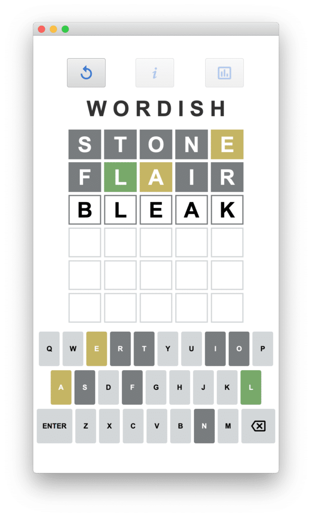
Here’s an example screenshot of Wordish.
You can access the code on github here: https://github.com/gailasgteach/Wordish.
Part 2: Look and Feel Enhancements
Wordish uses a specialized Label control that reflects the user’s guess compared to the target word. Similarly, the virtual keyboard Button control must also reflect the matching status of its specific key.
Let’s examine how to provide specialized Label and Button controls that hold meaningful state in our application. We’ll extend the standard controls and add JavaFX properties.
By leveraging these properties with CSS pseudo-classes, you’ll see how to keep the UI synchronized with the model when updating the controls’ properties.
Special icons add flair to an application, so we picked a few appropriate icons from the iKonli Font Library. We show you how to incorporate such third-party icons in JavaFX applications.
It’s straightforward to add our specialized controls as well as third-party libraries to Scene Builder. This means you can continue to use Scene Builder visualizations, even when your controls and fonts are not part of the standard JavaFX library.
Finally, we show you some of the CSS customizations we use to help keep our UI looking Wordishly.
Specialized Label Control
For the Labels in TilePane and the Buttons in FlowPane, we add state to these controls to reflect the matching status of its letter as the user plays Wordish.
For the Label, here’s class LetterLabel with two added JavaFX properties:
public class LetterLabel extends Label {
    private final ObjectProperty matchResult = new
         SimpleObjectProperty<>(DISPLAYING);
    private final ObjectProperty letterDisplay = new
         SimpleObjectProperty<>(PLAIN);
    . . .
}
Property matchResult holds the status of that letter’s match against the target word: exact match, partial match, or no-match. Since we don’t reveal match results until after animating the tiles, a second property, letterDisplay, determines the CSS styling of the LetterLabel. DisplayType is an enum that reflects one of the five possible states of a LetterLabel.
public class LetterStyle {
     . . .
    public enum DisplayType {
            PLAIN, DISPLAYING, NOMATCH, PARTIALMATCH, MATCHING;
    }
}
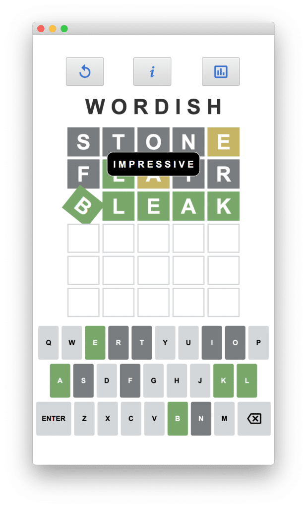
Figure 2 illustrates all five DisplayType enum states: The three lower rows of LetterLabel in the TilePane are styled with DisplayType PLAIN. The word “BLEAK” is styled with DisplayType DISPLAYING. This state applies when the user is entering the word before submitting it. The words “STONE” and “FLAIR” illustrate the other three DisplayTypes applied after the matching process is complete: the L in FLAIR is MATCHING, the E in STONE and the A in FLAIR is PARTIALMATCH, and the remaining LetterLabels are DisplayType NOMATCH.
Specialized Button Control
Similar to LetterLabel, the virtual keyboard is made up of enhanced Button controls called KeyButton. Here, we add a single JavaFX property to reflect the status of that keyboard letter in the current game.
public class KeyButton extends Button {
    private final ObjectProperty letterDisplay = new
         SimpleObjectProperty(PLAIN);
    . . .
}
As Figure 2 illustrates, key L is MATCHING, keys E and A are PARTIALMATCH, and keys R, T, I, O, S, F, and N are NOMATCH. The remaining keys are PLAIN.
When you submit a word, the controller code updates the LetterLabel and KeyButton states. In the following code snippet, we invoke the setter for property matchResult, which specifies that the letter in the LetterLabel is matching.
// ll is LetterLabel, **pseudo code here**
// Do we have a match?
if (isMatching(ll.getText())) {
   ll.setMatchResult(MATCHING);
}
After processing the submitted word, we update the LetterLabel’s letterDisplay property with the value from its matchResult property.
// update the LetterLabel’s letterDisplay property
ll.setLetterDisplay(ll.getMatchResult());
Next, we synchronize the associated key in KeyButton by updating its letterDisplay property. Here, list is the row of LetterLabel controls for this play and keyLetters is a Map. Note that we use the Map’s key to identify the KeyButton control for LetterLabel’s letter.
list.stream().forEach(ll -> keyLetters.get(ll.getText())
            .setLetterDisplay(ll.getMatchResult()));
Importantly, by calling the JavaFX property setter setLetterDisplay() for both LetterLabel and KeyButton, the UI styles automatically update to reflect the matching state. To see how this works, let’s discuss CSS pseudo-classes with the well-known Button control.
CSS Pseudo-Classes
Many JavaFX controls, including Button, have a JavaFX property called disableProperty. To disable button myButton, for example, use
myButton.setDisable(true); // disable myButton
When this code executes, the UI reflects the disabled state by reducing the opacity of the control. Note that we don’t update the styling ourselves. JavaFX implements this styling behavior with CSS pseudo-classes, where a change in a property triggers a change in the node’s CSS styling.
We want this same behavior for both LetterLabel and KeyButton, where updates to the letterDisplay property automatically update the UI.
For this to work, we have to build CSS scaffolding in our classes. Let’s return to our LetterStyle class where we define the DisplayType enum. Here, we associate each DisplayType enum with a pseudo-class that names a CSS state.
import javafx.css.PseudoClass;

public class LetterStyle {
    public static final PseudoClass PLAIN_PSEUDO_CLASS =
          PseudoClass.getPseudoClass("plain");
    public static final PseudoClass DISPLAYING_PSEUDO_CLASS =
          PseudoClass.getPseudoClass("displaying");
    public static final PseudoClass NOMATCH_PSEUDO_CLASS =
          PseudoClass.getPseudoClass("nomatch");
    public static final PseudoClass PARTIALMATCH_PSEUDO_CLASS =
          PseudoClass.getPseudoClass("partialmatch");
    public static final PseudoClass MATCHING_PSEUDO_CLASS =
          PseudoClass.getPseudoClass("matching");

    public enum DisplayType {
            PLAIN, DISPLAYING, NOMATCH, PARTIALMATCH, MATCHING;
    }
}
Let’s examine the pseudo-class returned by PseudoClass.getPseudoClass("matching"). Here, the styling is identified in our CSS file and depends on the node. For LetterLabel control in a TilePane, for instance, style class .matching-letter in state matching has the following style.
.tile > .matching-letter:matching {
    -fx-outer-border: -fx-match-color;
    -fx-body-color: -fx-match-color;
    -fx-text-fill: -fx-text-fill-alt-color;
}
And for a KeyButton control in a FlowPane, style class .matching-letter in state matching is defined as follows.
.flow > .matching-letter:matching {
    -fx-button-base-color: -fx-match-color;
    -fx-text-fill: -fx-text-fill-alt-color;
}
Note: Colors -fx-match-color and -fx-text-fill-alt-color are defined elsewhere in the CSS file.
There are similar style classes defined for states plain, displaying, partialmatch, and nomatch for controls in TilePane. We also have classes defined for states plain, partialmatch, and nomatch with controls in FlowPane. We assign these style classes to our customized controls in the LetterLabel and KeyButton constructors with the following (for example).
getStyleClass().add("matching-letter");
Reacting to Property Updates
The final piece of scaffolding code is to react when the KeyButton and LetterLabel letterDisplay property updates. Since JavaFX properties are observable, we add this code to the property’s invalidated() method. This method is invoked each time you call the property setter.
Here is the letterDisplay property for LetterLabel. We leverage the Java 14 switch syntax, which makes this code more streamlined than the pre-Java 14 switch statement. The KeyButton letterDisplay property is similar, but with style “displaying-letter” not needed.
public class LetterLabel extends Label {
    public LetterLabel() {
          super();
        // assign these style classes to our customized controls
          getStyleClass().add("displaying-letter");
          getStyleClass().add("matching-letter");
          getStyleClass().add("nomatch-letter");
          getStyleClass().add("partialmatch-letter");
          getStyleClass().add("plain-letter");
    }

    private final ObjectProperty letterDisplay = new
          SimpleObjectProperty<>(PLAIN) {
        @Override
        public void invalidated() {
            // Turn off all custom PseudoClasses in the LetterLabel,
            // then uses a switch statement to set a
            // specific PseudoClass that depends on the value
            // in the letterDisplay property
            pseudoClassStateChanged(PLAIN_PSEUDO_CLASS, false);
            pseudoClassStateChanged(DISPLAYING_PSEUDO_CLASS, false);
            pseudoClassStateChanged(NOMATCH_PSEUDO_CLASS, false);
            pseudoClassStateChanged(PARTIALMATCH_PSEUDO_CLASS, false);
            pseudoClassStateChanged(MATCHING_PSEUDO_CLASS, false);
            switch (get()) {
                case PLAIN ->
                    pseudoClassStateChanged(PLAIN_PSEUDO_CLASS, true);
                case DISPLAYING ->
                    pseudoClassStateChanged(DISPLAYING_PSEUDO_CLASS, true);
                case NOMATCH ->
                    pseudoClassStateChanged(NOMATCH_PSEUDO_CLASS, true);
                case PARTIALMATCH ->
                    pseudoClassStateChanged(PARTIALMATCH_PSEUDO_CLASS,
                    true);
                case MATCHING ->
                    pseudoClassStateChanged(MATCHING_PSEUDO_CLASS, true);
            }
        }
    };
. . .
}
The invalidated() method for property letterDisplay must ensure that a pseudo-class state is mutually exclusive. That is, no letterDisplay pseudo-class state can match more than one state. Therefore, before turning on the matching pseudo-class state, we make all pseudo-class states false, as shown above.
Note: See LetterStyle.java, LetterLabel.java, and KeyButton.java for the above discussion.
Note: See styles.css for the CSS styles used in Wordish.
iKonli Font Library
It’s easy to add flair to your applications with third party icon packs. In Wordish, we use the iKonli Font Library for the Delete Key as well as the Replay, Information, and Stats (Bar Chart) buttons. In addition, the Close icon lets you return to the main view from either the Information or Stats view. These icons are based on Material Design. Using familiar icons and fonts help make an application intuitive when you match icons with common, expected behavior.
To access the iKonli Font library in Wordish, we add appropriate modules to the module-info.java file, as follows.
module wordish {
    . . .
    requires org.kordamp.ikonli.core;
    requires org.kordamp.ikonli.javafx;
    requires org.kordamp.ikonli.materialdesign2;
      . . .
}
And add these dependencies to the pom.xml file.
org.kordamp.ikonli ikonli-javafx 12.3.1 . . . org.kordamp.ikonli ikonli-materialdesign2-pack 12.3.1
Here’s how to add an icon graphic to either a Button or Label in FXML. For example, we add the Delete icon named "mdi2b-backspace-outline" to our virtual keyboard KeyButton control. Note that you can specify its pixel width with attribute iconSize.
The Material Design2 cheat sheet provides a handy list of other iconLiteral codes that you can incorporate into your UI.
Adding Custom Controls to Scene Builder
To use customized controls with Scene Builder, supply a JAR file with these compiled classes. After you import them into Scene Builder, you can use Scene Builder’s visual features with your custom controls. Similarly, to incorporate third party icons within Scene Builder, import the required JAR file or repository.
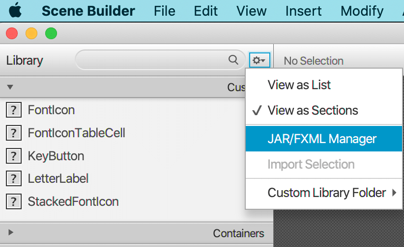
From the Scene Builder Library menu, select the Settings icon (at the top next to Library) and the JAR/FXML Manager, as shown in Figure 3.
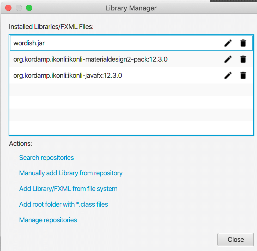
Scene Builder will then display the Library Manager. To add the KeyButton and LetterLabel classes, select Add Library/FXML from file system, as shown in Figure 4. Supply the jar file containing the compiled class files for LetterLabel, KeyButton, and LetterStyle (here, file wordish.jar).
Once you add them, the classes appear in the Custom section under Library. You can then select a LetterLabel, for example, place it in your visual view, and even configure its properties, including the custom properties letterDisplay and matchResult that we showed earlier.
For the iKonli Font Library, select Search repositories and provide the Group or Artifact ID. You can then select the libraries you need.
Customizing CSS
Besides providing style classes to support the customized pseudo-classes, we also added custom styles to support the look you see in Figure 2. We styled the application using root values for certain colors.
By assigning names to these colors, such as -fx-match-color, we can reuse them throughout the style sheet. We can even change the color theme of the entire application just by changing the colors assigned to our color names.
For our application, each FXML file uses the same style sheet. By identifying the CSS style sheet in the FXML file, Scene Builder can accurately reflect the styles you’re using. Furthermore, the views share many of the same style settings.
We use black and white for the letter stroke color. Wordish has four main colors: a basic button background color and three match result colors: goldish, greenish, and dark gray. We define these in the style sheet root style as follows.
.root {
    -fx-button-base-color: #d3d6d9;
    -fx-text-fill-base-color: black;
    -fx-text-fill-alt-color: white;
    -fx-partialmatch-color: #c5b565;
    -fx-nomatch-color: #797c7e;
    -fx-match-color: #78a86b;
}
These colors are then reused when we define our pseudo-class states.
Normally, when a JavaFX button is disabled, its opacity is reduced to .4. To mimic the Wordle UI, we override this behavior by leaving disabled buttons in our virtual keyboard fully opaque, as shown.
.flow > .button:disabled {
    -fx-opacity: 1.0 ;
}
However, we commented out the above style during development and testing, since it was helpful to notice when we disabled a button.
Note: See styles.css for the CSS styles used in Wordish.
Next: In Part 3 we’ll examine the controller code. The controller code maintains game state and responds to user input with appropriate updates to the UI.
The post Wordish with JavaFX – Part 2 appeared first on foojay.